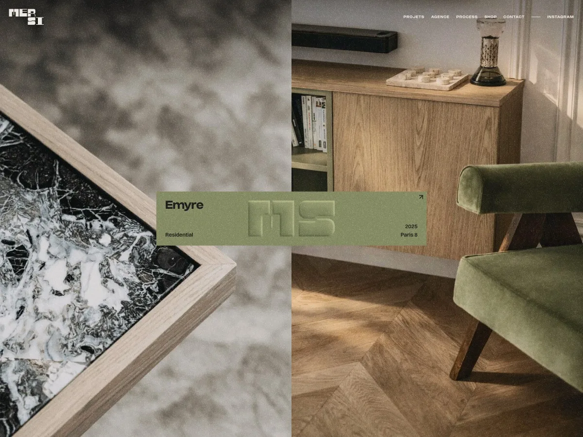
MERSI, a Paris-based architecture studio known for its refined spatial approach, faced a fundamental problem: their website did not represent them. Built on a generic Webflow template locked into a monthly subscription, the site felt disconnected from the studio's sensibility and carried none of their brand identity. When they approached FLOT NOIR, the task extended far beyond a cosmetic refresh—it demanded a complete reconstruction of their digital presence.
Breaking Free From the Template
MERSI's existing website operated within severe constraints. The generic framework, while familiar to the team, had become a liability rather than an asset. The visual system bore no relation to the studio's work, and similar templates circulated among competing practices in the field. For an architecture practice where image precision and positioning are fundamental, this generic approach created a real disconnect. Internally, the website was never fully embraced—it existed without carrying the brand.
FLOT NOIR's first objective was straightforward: help MERSI regain control. The decision to retain Webflow proved crucial. Rather than abandoning the platform, the team treated it as a CMS and publishing foundation while rebuilding everything else from scratch. The structure, layouts, visual direction, interactions and custom code layer were all redesigned to create something entirely tailored to the studio. Webflow itself was not the limitation—the template was.
Rebuilding the Visual World
The website redesign formed part of a broader brand refresh. MERSI already possessed a logo and monogram designed by Morgane Tubiana, and the goal was not replacement but recontextualization. The previous visual identity felt too aggressive for the studio—heavy purple tones and decorative language that clashed with the quiet elegance of their architectural work. MERSI wanted to move toward something more refined, closer to what might be called quiet luxury: subtle, precise, tactile and confident without being demonstrative.
The new visual atmosphere was built on restraint, contrast, materiality and editorial rhythm. The identity needed to feel premium without coldness, minimal without emptiness, digital yet materially present. The framework had to recede so the projects could take the lead.
The Space Between Print and Screen
From the outset, FLOT NOIR envisioned the website occupying a space between an architectural book and an interactive digital experience. Architecture traditionally lives in carefully composed printed portfolios, where image placement, white space, typography and photography relationships create a specific rhythm. The team wanted to bring that sensitivity into the browser without imitating print.
Layouts were designed with strong editorial influence. Pages are composed rather than filled. Images function as material rather than content blocks. Typography acts as structure. Shapes, labels and transitions create framing and movement. Yet the experience remains unmistakably digital, using interaction, motion and transitions to extend editorial logic into something alive. The result is a visual system that feels calm, precise and immersive while offering moments of surprise.
Designing for the Projects
The website's primary purpose was singular: to elevate MERSI's projects. Yet the available visual material presented a real design challenge. Many project images were portrait-oriented, which typically proves difficult on the web when creating immersive layouts without aggressive cropping or repetitive composition. Instead of forcing every project into a conventional grid, FLOT NOIR designed a flexible visual system where portrait images became a strength. Vertical rhythm, tension and a gallery-like feeling emerged naturally. This approach avoided the predictable full-width image sequences common in architecture portfolios, allowing each project to feel curated. The interface creates space around the work, gives each image appropriate presence and guides users through content without overexplaining.
Signature Interactions
The Split-Screen Slider
A key component is the split-screen slider, built around two large visual areas and a central label system. This composition creates strong tension between images while the label anchors the middle of the screen. The interaction is simple to understand but visually memorable, offering users a way to move through projects without relying on standard carousel patterns. For an architecture studio, this felt natural—almost like moving through a visual spread with a digital layer of control and movement.
Entering a Case Study
The transition into a case study was designed as a deliberate moment. Rather than a standard page load, the project cover flips and leads users into the case study experience. This movement creates continuity between project listing and project page, making navigation feel more physical. The cover becomes a transitional object, not merely a thumbnail. This detail mattered because the website is built around materiality—interactions feel connected to the visual language, not added as decorative effects. Once inside, the case study moves into a horizontal scroll structure, creating a more cinematic and editorial navigation experience.
Grid Repositioning on Scroll
As users scroll through the projects page, the projects progressively reposition into a more structured grid. The layout begins with dynamic composition and gradually resolves into order. This movement reflects the relationship between freedom and structure—a balance fundamental to architecture itself. A project can feel fluid, emotional or atmospheric, yet always rests on a rigorous underlying system. The animation gives the project index stronger narrative quality, transforming the page into a spatial composition that reorganizes itself as users move through it.
Building the Technical Foundation
Although built on Webflow, the experience was designed and developed as a custom digital product. Webflow provided the CMS structure and editing environment, allowing the MERSI team to maintain control over their content. Thomas Carré developed the custom interaction layer that gives the website its distinctive behavior. This hybrid approach combined two essential needs: client autonomy and high-level creative execution. The project was never about proving what Webflow could or could not do, but about using the right parts of the tool and extending it where precision was required. The result remains manageable for the client while feeling far from a standard Webflow build.
Technical Stack
The site runs on Webflow for structure and CMS, with a fully custom JavaScript layer bundled with Vite and deployed on Netlify. The animation stack includes:
- GSAP (with ScrollTrigger, SplitText, and Flip) for all animations
- Lenis for smooth scrolling
- Taxi.js for page transitions
- Splide for the news slider
Everything else is custom vanilla JavaScript with no UI frameworks.
Cover Flip Transition
Two distinct transition types are registered in Taxi.js: a DefaultTransition (curtain wipe) and a FlipTransition for project links tagged with a [flip-transition] attribute. On leave, the FlipTransition captures the currently visible slide image using getBoundingClientRect() and clones it into a fixed-position overlay on the <body>, completely detached from the DOM flow. A single right-side curtain wipes up to cover the old page. On enter, GSAP Flip.fit() animates that floating clone directly into its target container on the new page (.img-project-flip), morphing position, size and aspect ratio simultaneously over 1.2 seconds with an expo.inOut ease. Once complete, the clone is re-inserted into the target container as a permanent replacement for the native image element. On mobile, the flip mechanic is skipped entirely, with both curtains animating using clip-path instead (top half down, bottom half up).
Horizontal Scroll on Case Studies
A GSAP ScrollTrigger-driven approach powers the horizontal scroll: a .horizontal_track element is pinned while a gsap.to() tween translates it on the X axis, converting vertical scroll distance into horizontal movement. The total X distance is computed as track.scrollWidth - window.innerWidth, recalculated on refresh via invalidateOnRefresh: true. The ScrollTrigger end is set dynamically to match exactly. Lenis fires a scroll event that calls ScrollTrigger.update() on every frame to stay in sync. The whole system waits for document.fonts.ready before calculating dimensions, avoiding layout jumps from late-loading fonts. A cancelled flag prevents the async callback from running if cleanup was called between navigation.
Project Grid Repositioning
The projects page maintains two DOM states: grid__state__1 (the initial compact grid with a few visible images) and grid__state__2 (the full expanded layout). When users scroll into the projects section, GSAP Flip handles the transition. Flip.getState() captures the current position and size of each image in grid 1. The images are physically moved in the DOM into their target slots in grid 2. Flip.from() animates them from their captured positions to new ones with 2 second duration, expo.inOut ease, and a 0.05 second stagger. Images beyond a MAX_VISIBLE_IN_GRID1 threshold are hidden initially and fade in during the flip. The filter widget also participates in the Flip, getting captured, moved to a new parent and animated to its new position simultaneously. Scrolling back up reverses the entire animation: images return to grid 1 with a shorter 1.2 second power4.inOut ease and reverse stagger. Any images hidden during the initial flip get a separate clip-path reveal on the way back. On mobile, the grid flip is disabled and only the filter system stays active.
Split-Screen Slider Architecture
Both the home slider and project slider share the same architecture: two synchronized lists (.left and .right) of stacked full-screen images, all overlapping in the same space. Visibility is controlled entirely through clip-path: inset(...). There is no opacity or display toggling. The left column reveals slides from the top (inset(X% 0% 0% 0%)), while the right column reveals from the bottom (inset(0% 0% X% 0%)). As users scroll, the progress between the current and next index is computed and the inset value is driven directly from that float, giving a scrub-like feel without actually using ScrollTrigger scrub. The central label/button overlay uses the exact same clip-path technique, revealing in sync with the slides. This means all three layers (left image, right image, label) are always in perfect sync with a single progress value. The home slider handles infinite looping by creating a very tall wrapper (100 × slideCount × vh) and silently repositioning the scroll to the middle section whenever users approach the edges—completely invisible to them.
Infinite Slider Repositioning
if (relativeScroll < lowerThreshold || relativeScroll > upperThreshold) {
  const cyclicPosition = relativeScroll % cycleHeight
  const newScroll = wrapperTop + middlePosition + cyclicPosition
  isRepositioning = true
  lenis.scrollTo(newScroll, {
    immediate: true,
    onComplete: () => {
      requestAnimationFrame(() => {
        isRepositioning = false
      })
    }
  })
  return
}
The cyclicPosition ensures the visual state is preserved exactly and users never perceive the jump.
GSAP Flip Page Transition
Flip.fit(clone, targetContainer, {
  duration: 1.2,
  ease: 'expo.inOut',
  onComplete: () => {
    Object.assign(clone.style, {
      position: 'absolute',
      top: '0',
      left: '0',
      width: '100%',
      height: '100%',
      transform: '',
      zIndex: ''
    })
    targetContainer.appendChild(clone)
    if (nativeImg) nativeImg.remove()
    clone.removeAttribute('id')
  }
})
After the animation, the clone is permanently adopted into the new page's layout and the original native image is removed, preventing any visual pop when the transition ends.
A Website the Studio Could Own
Beyond visual and technical execution, the project's most important outcome was emotional. MERSI needed a website they could recognize as their own. Their previous solution had created distance between the studio and its digital presence—it felt generic, difficult to embrace and disconnected from their desired perception. With this redesign, the website became a more accurate extension of their work: refined, quiet, visual and precise. It also became a stronger business tool, not because it explains everything but because it creates the right perception from the first interaction. The studio gained a more distinctive digital presence and a more confident way to present its projects.
Recognition and Impact
After launch, the MERSI website received several recognitions from the creative and digital design community:
- AWWWARDS — Site of the Day
- FWA — FOTD
- CSSDA — WOTD
- GSAP — Site of the Week
- Communication Arts — Featured
These awards were not the project's goal, but they confirmed that a carefully crafted architecture website can still feel distinctive, even in a field often dominated by restrained, template-like portfolios. The recognition rewarded both sides of the work: the quietness of the visual direction and the precision of the interactive layer.
Conclusion
MERSI's website emerged from a simple but demanding ambition: to create a digital presence as considered as the studio's architectural work. The project was not about adding complexity for its own sake, but about replacing a generic system with a tailored experience. It was about using Webflow without being limited by a template, about creating a visual language that could feel quiet, premium and interactive simultaneously. Most importantly, it was about designing a website that could finally serve the studio rather than constrain it—a space somewhere between print and digital, between structure and movement, between silence and interaction.
Credits
Produced by FLOT NOIR. Website & Branding: Clément Merouani. Creative Dev: Thomas Carré. Logo and MS monogram: Morgane Tubiana. Thanks to Meryl Motyka and Simon Mimoun for their trust.
Source: Codrops