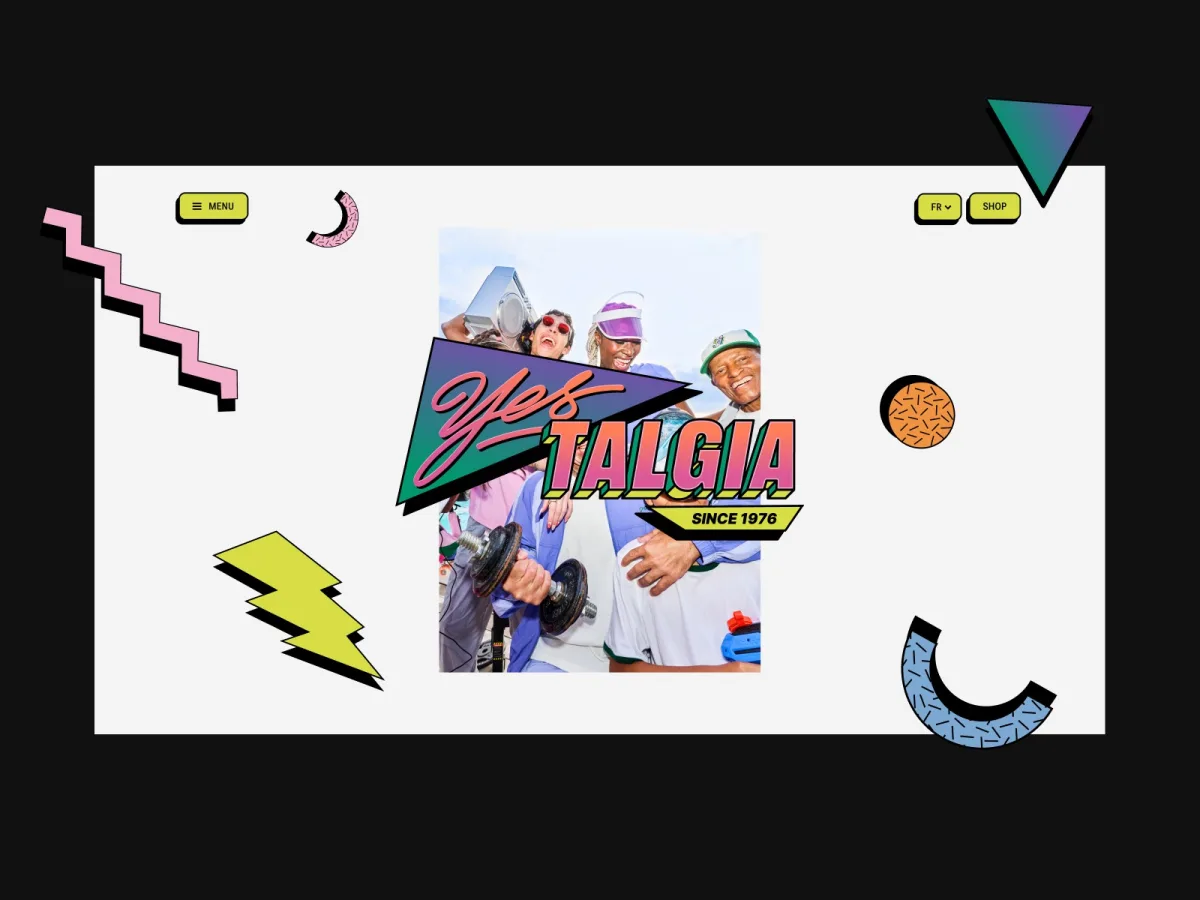
Decathlon commissioned a bespoke digital experience for Yestalgia, its nostalgic capsule collection that reinterprets 1990s aesthetics through a modern lens. The challenge was to build a high-performance web platform that would celebrate the collection's archival pieces while maintaining the vibrant, playful energy of the campaign itself.
Design
Working with design studio Dalkhafine, the team created a visual identity anchored in bold illustrations, expressive type and period references that blend outdoor heritage with pop culture. The core problem was translating this creative direction into a web experience that felt alive without sacrificing performance or usability.
A Product-First Editorial Approach
Rather than treating products as secondary to interface chrome, the layout prioritizes imagery and merchandise through large-scale compositions and minimal UI elements. This approach mirrors the experience of browsing a campaign publication rather than navigating a conventional e-commerce catalogue, allowing each item to command immediate attention.
Bringing the Campaign into the Interface
Graphic sequences featuring typography, shapes and motion punctuate the product moments, acting as visual palate cleansers that shift rhythm throughout the journey. Rather than treating campaign assets as mere decoration, they became part of the site's core visual language, creating continuous interplay between merchandise, type, illustration and interaction.
The Walkman
Navigation transforms into a cassette player inspired by the collection's decade-specific references. Each tape destination becomes selectable, and choosing one triggers a satisfying interaction where the cassette snaps back into the deck before revealing the chosen section. This approach made the nostalgic concept tangible without complicating the underlying navigation structure.
A 90' Graphic Thread
Recurring shapes and lines connect different sections throughout the site. Subtle micro-interactions bring these elements into motion: lines extend, shapes shift and graphic details respond as visitors move through the experience. Rather than relying on heavy effects, motion integrates directly into the visual system itself, creating rhythm between all design components.
Animation
A series of looping animations based on the artist's illustrations add movement and depth across the experience. These understated sequences contribute rhythm and a sense of continuous life to the overall design.
Development
The real challenge: a creative site the client can actually update
Built on WordPress with a fully custom theme and shipped in 7 languages, Yestalgia required solving an invisible constraint: maintaining art direction while giving the client genuine editorial control. Every section became a Blockstudio block—a JSON schema paired with a Twig template—allowing the client to reorder, recompose and swap content without touching code or compromising the design.
The front-end runs on piecesjs, a lightweight framework built on native web components that lets each piece lazy-import only its own JavaScript and CSS. A shared utility library carries across projects, with the Scroll Piece being most critical here: it connects Lenis to GSAP ScrollTrigger and centralizes scroll-related behavior through data attributes, wiring interactivity directly into markup.
The menu: a walkman you can load 📼
The Walkman navigation proved the project's biggest technical challenge and most rewarding element. A cassette player rises into frame, tapes slide out, and selecting one makes it snap back into the deck before the device disappears to reveal the chosen section. Achieving that physical sensation required close collaboration between development and motion design.
The developer built an initial working version from the design, then motion designer Michal reworked the easings, delays and durations to make the cassettes feel like real objects rather than simple tweens. Those refined settings were ported back into code for final tuning. A small bounce on close mimics the click of a cassette seating in its slot. Hovering a menu item swaps background color and its matching sunset layer, while mobile devices receive haptic feedback.
Big title reveals
Large scroll-triggered headlines feature a fake-3D extruded thickness created entirely without 3D rendering. Each character (or word on mobile) is doubled with a duplicate positioned slightly behind it, creating an embossed depth effect as letters slide into place. A stagger between letters walks the reveal across the line, while a delay between each letter and its duplicate creates the depth illusion. The fade-in runs faster than the translate to keep the effect lively. Mobile splits by words for performance, and reduced-motion mode drops all durations to zero so headlines still assemble instantly.
Rive for the vector animations
Every Rive animation loop is gated by an intersection observer, starting only when entering the viewport and pausing when leaving, so GPU cycles never burn on unseen motion. Reduced-motion mode scrubs animations directly to their final frame rather than skipping them, preserving the intended composition while removing movement.
Motion declared in markup
Two simple primitives handle most decorative motion on the site without requiring new JavaScript for reuse. The first is a generic scroll-driven timeline component whose entire definition lives in HTML: a from state, a to state, optional easing and duration, plus a portrait variant. The markup can declare where in the viewport animation should start and stop, letting the same component be tuned per section without additional code. The component parses these values, builds a GSAP timeline, and the Scroll Piece drives progress as the element crosses the viewport. Dozens of animations across the site use this approach, declared entirely in markup.
The second primitive is the satellite—small decorative elements that rotate endlessly. Each picks a random starting angle and direction so none sync, and rotation runs on Tempus, a single shared animation loop for the entire page normalized against delta time for identical speed at 60 or 120fps. Satellites subscribe when entering the viewport and unsubscribe when leaving, costing nothing when off-screen.
The infinite draggable carousel
The fullscreen infinite carousel uses GSAP's seamless-loop technique, with a master timeline choreographing each card's position, scale and tilt. Every other card tilts opposite, creating rhythm. The carousel magnets to the nearest slide, and the newly active card triggers its own title reveal with synchronization between slides and titles managed by piecesjs.
The footer lookbook
Only one image opens at a time in the lookbook section, and the entire section maintains constant height throughout browsing, preventing the rest of the page from jumping. The challenge was timing: each image must start opening at the right moment relative to its title while surrounding content shifts due to images opening above or below. Achieving seamlessness required numerous small adjustments.
Tech stack
- Back-end: WordPress with custom Timber-based theme, Blockstudio for visual block editing, Polylang for 7-language support
- Front-end: piecesjs with native web components, Tailwind v4 and PostCSS
- Motion: GSAP (ScrollTrigger, Draggable, SplitText), Lenis for smooth scroll, Rive for vector animations, Tempus for shared animation loop
- Interaction: web-haptics for mobile feedback
- Build: Vite
Source: Codrops