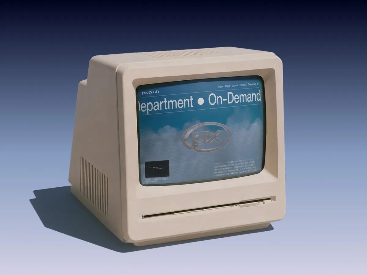
PX PUSH operates as a subscription design studio focused on Freedom Tech—the decentralisation and open economic movement—a sector where design support remains sparse. The teams working in this space operate with speed and transparency, shipping publicly and iterating openly. Yet most design agencies and studios speak a different language entirely. The studio's website needed to embody this operational philosophy: methodical, transparent, and delivered with a wry sense of humour about the whole endeavour.
The visual identity draws inspiration from 1980s corporate aesthetics: bureaucratic terminology, office machinery, software packaging, and the kind of organisational rigour that would stamp documents "approved for continued use" without a trace of irony. This period reference shapes every element. Visitors experience the site through a simulated convex CRT monitor—a persistent overlay that sits between them and the content on every page. The guiding question became: what would this design look like displayed on a 1988 screen?
Technical Foundation
- Nuxt 3 — handles server-side rendering, static generation, file-based routing, and the entire application
- GSAP + ScrollTrigger — powers nearly all scroll-driven reveals, parallax effects, and hover interactions through a custom attribute system
- Lenis — manages smooth scrolling, manually ticked from a single GSAP clock to keep scroll interpolation and ScrollTrigger effects synchronised; disabled on mobile in favour of native scrolling
- Three.js — three separate WebGL scenes, each addressing a distinct challenge: an extruded chrome logo, a cloud-flight hero sequence, and a floppy disk in the pricing area
- @nuxt/content — the Journal section runs on markdown files, queried at build time and request time, with no external CMS required
- Splitting.js — breaks headings and paragraphs into lines and words within the DOM to enable reveal animations
The Screen You're Looking Through
The CRT effect lives within a single component called Wrapper.vue, positioned above the rest of the application. The effect assembles from a series of fixed-position overlays. A scanline bar sweeps from bottom to top over an 8-second cycle. A faint repeating line pattern mimics CRT refresh lines. A soft backdrop-filter: blur layer produces a light bloom effect reminiscent of aged glass. A full-screen crt.png overlay stretches across the viewport, darkening and distorting the edges to resemble the curved glass of a vintage monitor. An animated noise texture adds a subtle layer of screen static.
The entire effect runs on CSS and two images, continuously active throughout the user's session:
.scanlines::before { background: rgba(0, 0, 0, .7); animation: scanline 8s linear infinite; } .gloom::before { backdrop-filter: blur(10px); opacity: .15; } .vignette::before { background-image: url("/img/crt.png"); background-size: 100% 100%; transform: scale(1.02); opacity: .7; }
Period references guided the rest of the design system. The primary blue, #03049C, originates from the Windows Blue Screen of Death. The grey, #BABABA, was selected to evoke the plastic casing of early Macintosh computers and office electronics.
The hero section needed to feel like an operating-system wallpaper or startup screen, which led to the cloud-flight WebGL scene. The floppy disk in the pricing section takes the concept of purchasing a design "package" literally, referencing how software was once sold as physical media on floppy disks.
Three.js: Three Scenes, Three Jobs
Three separate Three.js scenes serve different sections of the site. The first is the PX PUSH logo. The SVG loads through SVGLoader, extrudes into geometry, receives bevels, and applies a metalness and clearcoat material under PMREM environment lighting to achieve a mirrored chrome finish.
As the page scrolls, the logo scales down and shifts from the hero's centre into the header. Scroll velocity controls its rotation: faster scrolling increases the spin, while reversing direction reverses the rotation. Once positioned in the header, it becomes the link back to the homepage.
function update() { const progress = gsap.utils.clamp(0, 1, window.scrollY / lockScrollY) const scale = gsap.utils.interpolate(1, finalScale, progress) const top = Math.max(stickyTop, startTop - window.scrollY) gsap.set(logo, { position: "fixed", top, left: (window.innerWidth - startWidth) / 2, scale, transformOrigin: "50% 0%", }) } function updateLogoScrollSpin(velocity) { logoScrollSpinTarget = gsap.utils.clamp( -logoScrollSpinMax, logoScrollSpinMax, -velocity * logoScrollSpinStrength ) } function renderLogoFrame() { logoScrollSpinTarget *= 0.9 logoScrollSpin += (logoScrollSpinTarget - logoScrollSpin) * 0.16 logoGroup.rotation.y += logoIdleSpin + logoScrollSpin renderer.render(scene, camera) }
The second scene is the cloud-flight hero. It combines roughly 8,000 cloud planes into a single buffer geometry, with a custom GLSL shader that fades their edges and applies distance fog. A hover easter egg hides in the hero copy: hovering over the word "speed" increases the camera's flight-speed multiplier from 0.2 to 2, then returns it to normal when the mouse leaves. This small interaction—hover the word "speed", the scene accelerates—justified the extra state tracking.
The third scene is the floppy disk in the pricing section. It uses a GLTF model whose glossiness map gets recoloured at runtime on a canvas rather than baked into a static texture. The model rotates and tilts based on scroll progress, positioned beside the section introducing the monthly design package.
All three scenes register themselves with the same lifecycle system before loading begins, which is where the engineering complexity concentrated.
The Founders Rotate Like a Character-Select Screen
The About page features each founder photographed from fifteen different angles, styled as 1980s corporate portraits. A small scroll accumulator connects to the image sequence. As visitors scroll, the page moves forwards or backwards through the frames, making each person appear to rotate in place. The effect mimics an old character-select screen, but uses real photography instead of a 3D model.
onUpdate: (self) => { const velocity = self.getVelocity() imageAccumulator += Math.abs(velocity) * getImageCycleSpeed() while (imageAccumulator >= 1) { const direction = velocity >= 0 ? 1 : -1 const images = getFounderImages(activeFounderIndex) const next = gsap.utils.wrap( 0, images.length, activeImageIndexes[activeFounderIndex] + direction ) gsap.set(".team__image", { autoAlpha: 0 }) gsap.set(images[next], { autoAlpha: 1 }) activeImageIndexes[activeFounderIndex] = next imageAccumulator -= 1 } }
Each profile includes a QR code generated at runtime, linking to each founder's personal website—styled with the same grey and blue colour tokens used throughout the page.
The Page Waits for the Scenes
Coordinating three WebGL scenes with page transitions presented the main engineering challenge. Nuxt's page hooks indicate when a component has mounted, but not when a scene has loaded its assets and rendered its first frame. Without additional coordination, the page could reveal itself while one of the scenes remained blank.
A small lifecycle—prepared → revealed → ready—was built as a plain pub/sub system using window events. Any component can register a promise through registerPageTask(). The page waits until every registered task has settled, or until a hard timeout expires:
const pendingTasks = new Set() export function registerPageTask(task) { const pendingTask = Promise.resolve(task).catch(() => {}) pendingTasks.add(pendingTask) pendingTask.finally(() => pendingTasks.delete(pendingTask)) return () => pendingTasks.delete(pendingTask) } export function waitForPageTasks() { return Promise.allSettled([...pendingTasks]) }
The logo, cloud hero, and floppy disk register themselves upon mounting. This allows the page to wait for all three without creating direct connections between the scenes.
A Drawer Made of Paper
The Journal displays a list of articles. Rather than opening each article as a conventional new page, a drawer slides over the list, styled to resemble a sheet of office paper. A repeating paper-grain texture sits over a cardboard texture. The left edge uses a live CSS mask to create a vertical line of transparent punch holes:
.journalDrawer__panel { --hole-x: 2vw; --hole-radius: .55vw; --hole-gap: 50vh; mask-image: radial-gradient( circle at var(--hole-x) 50%, transparent 0 var(--hole-radius), #000 calc(var(--hole-radius) + 1px) ); mask-size: 100% var(--hole-gap); mask-repeat: repeat-y; }
The drawer maintains its own Lenis instance for internal scrolling. It waits for the page lifecycle's ready event before opening, and only returns the route to /journal after the closing transition completes. Each article retains its own slug, canonical URL, Open Graph tags, and BlogPosting schema. The drawer changes how the article appears, but not how it is routed or indexed.
The Error Page
The 404 and 500 pages recreate a classic Blue Screen of Death using a full-screen blue background, monospace typography, and copy modelled on old Windows error screens. A line underneath reads "Press any key to continue _" — pressing any key clears the error and returns the visitor to the homepage. This approach also explains the origin of the site's primary blue without requiring an additional section or explanatory text.
The Marquee Titles Read One Word at a Time
Every major section title uses the same MarqueeText component: an oversized title repeated eight times and moving continuously across the screen. Two scroll-based effects layer over the constant movement. As the title enters the viewport, its words appear individually in random order, rotating in from a slight 3D perspective:
gsap.fromTo( words, { opacity: 0, z: -100, }, { opacity: 1, z: 0, rotationX: 0, stagger: { each: 0.03, from: "random", }, scrollTrigger: { trigger: el, start: "top 90%", end: "top 0%", scrub: true, }, } );
As the same title approaches the top of the viewport, it fades and blurs out:
gsap.fromTo( el, { opacity: 1, filter: "blur(0px)", }, { opacity: 0, filter: "blur(20px)", scrollTrigger: { trigger: el, start: "top 5%", end: "top -30%", scrub: true, }, } );
Both effects connect through a small declarative attribute system. Any element can receive an attribute such as effect__titleRandom or effect__fadeOut, and one function locates those elements and attaches the relevant GSAP timeline after each page loads.
The marquee also uses effect__separatorIn to reveal its top and bottom rules with a clip-path animation. The same system handles text fades, character reveals, parallax, and other transitions across the site.
Bringing the '80s Office into the Browser
The goal was not to recreate an old website, but to transport the visual language of 1980s corporate culture into a modern digital experience. The CRT overlays, chrome logo, cloud-flight scene, floppy disk, Blue Screen of Death reference, and the Journal paper drawer with punch holes all originate from the same era, yet are built with current Nuxt, Three.js, and GSAP technologies. Maintaining these references consistently across the site helped individual effects feel like components of a unified system rather than isolated visual ideas.
Design, concept, and development by Stud Creative House (stud.house), directed by Lewis Webber (wbbr.co), in collaboration with the PX PUSH team.
Source: Codrops