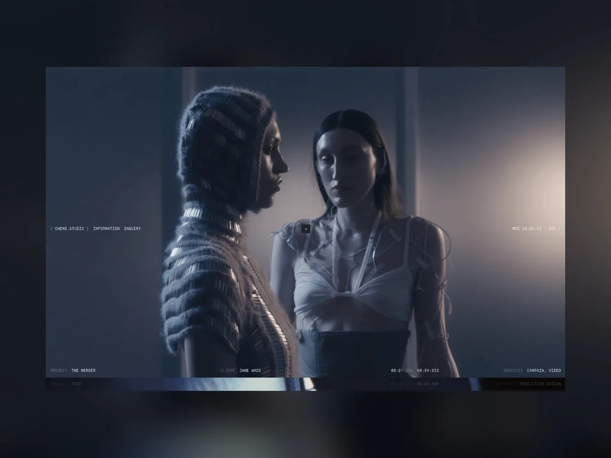
Chems.Studio operates as a creative direction and film practice headquartered in New York City, working across fashion, culture, identity and movement while pursuing authentic imagery and substantive storytelling.
When tasked with building a new website for the studio, the core problem wasn't displaying recent creations. Instead, the assignment demanded synthesizing multiple years of disparate projects—campaigns, films, set design, creative direction—each with its own distinct context, pacing and objective—into a cohesive visual framework.
Rather than constructing a conventional portfolio site, the designer chose to build an archive: a space where every project carries equal weight, where exploration happens organically, and where visitors construct their own interpretations through discovery.
A Quiet Structure
The foundation rests on a straightforward three-column grid system. Instead of rigidly prescribing every layout decision, the grid establishes a cadence that permeates the entire experience.
The landing page employs this grid as a full-page vertical progression. Within the archive section, it reorganizes into a three-column project display. When viewing individual projects, the identical structure shifts into a horizontal flow, enabling photographs and videos to develop across the viewport with natural ease.
The underlying system remains constant; what varies is its rhythm. This consistency generates recognition and comfort, while the varied applications of the grid allow each area to maintain its distinct personality.
Navigation as Movement
The navigation design prioritizes spatial movement over mechanical page transitions. The homepage and informational sections occupy the same hierarchical plane, while the archive exists in a slightly offset position—resembling an adjacent chamber rather than another destination. Accessing it becomes a subtle reorientation rather than a standard navigation action.
Swup.js enables these shifts to occur nearly imperceptibly, maintaining experiential continuity rather than creating jarring breaks. The site transitions between contexts while preserving the sense that visitors remain within a unified environment.
Building an Archive
Archives expand gradually, and this one was engineered with that trajectory in mind. The visual framework deliberately avoids excess, permitting incoming projects to settle naturally without forcing the site's identity to shift with each addition. The interface functions as a structural scaffold rather than a finished composition: it supplies sufficient coherence to unify the collection while preserving sufficient flexibility for individual projects to maintain their distinct character.
This distinction proved crucial throughout development. The website had to resist competing with the creative output or perpetually reshaping itself around the newest additions. It required the capacity to integrate change while preserving recognizability.
Image First
Textual content remains minimal across the site. The underlying principle was direct: imagery should establish the pacing. Photography, film and video stills function as the dominant medium, with language appearing only when necessary for orientation or explanation.
In this framework, restraint becomes a design strategy. By eliminating superfluous elements, the interface opens more room for the creative work itself and grants visitors autonomy in determining their visual focus.
Motion
Animation permeates the experience, yet it rarely demands notice. Transitions between pages maintain smoothness, imagery materializes without haste, and understated scramble-text effects subtly accompany navigation and interactive components. These combined elements inject quiet motion while reinforcing the archival essence—as though content were being continuously reorganized and reexamined.
Each animation serves a function. Whether supporting navigation, establishing rhythm or facilitating the unfolding of work, nothing exists purely for ornamental purposes.
Typography
A monospaced font extends throughout the interface, introducing a technical sensibility evocative of catalogues, production documentation and archival materials. It establishes deliberate tension with the expressive quality of the visual content while lending the site a measured and unified tone. The typeface doesn't attempt to rival the imagery; instead, it discretely anchors the entire system.
Tech Stack
The site was constructed using a streamlined technical foundation emphasizing efficiency and seamless continuity.
- Webflow
- Swup.js
- Vimeo API
- Custom Vimeo Player
Webflow enables the archive to expand over time with unrestricted editorial control. Swup.js maintains navigational continuity, while the Vimeo API and bespoke player integration ensure films feel fully embedded within the experience rather than functioning as detached external content.
Designing for Time
One principle guided the entire undertaking: creative work perpetually transforms. Fresh campaigns supersede earlier ones, influences shift, and a studio's visual vocabulary naturally evolves. The website, conversely, shouldn't require reinvention with each new project.
Rather than chasing visual fashions, the goal was constructing something understated enough to endure—a framework capable of accommodating new work across years while maintaining alignment with its origins. The objective centered on establishing a system that could flex with the studio's changing output without repeatedly redefining itself.
That, fundamentally, is the purpose of an archive. It transcends mere preservation of what came before; it manufactures sufficient room for what emerges next.
Source: Codrops